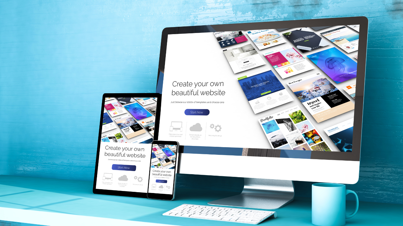
In today’s digital ecosystem, where we access online material via a variety of devices, Responsive Web Design (RWD) stands out as an important aspect of smooth browsing. Consider sitting down in a restaurant and receiving a dish that exactly suits your taste and dietary requirements, regardless of what you order. That’s the magic of RWD—it adjusts the content, layout, and interaction of a website to offer the best viewing experience on any device. Ethan Marcotte, who first coined the term, described it as a “liquid layout” that stretches or contracts to fit the container (or screen) it’s viewed on.
Understanding The Core
At its core, responsive design ensures that the experience remains similar regardless of whether you’re browsing a website on your PC at work, skimming it on your phone at a café, or researching it on your tablet from home. It is critical to ensure that the lettering is readable without squinting, that navigation is simple and does not require squeezing the screen, and that the content is engaging regardless of device.
Key elements of responsive design include:
- Fluid Grids: Visualise a webpage as an arrangement of boxes inside other boxes. These boxes can adjust proportionally to fit any screen size, be it a giant desktop monitor or a tiny smartphone, thanks to fluid grids.
- Flexible Images: Videos and images resize and enlarge according to the device, just like text does. This ensures that images are always readable and improves the user experience without making the page load slowly due to overly large file sizes.
- Media Queries: The website uses these clever code snippets to determine the size of the device’s screen. Following that, the website will automatically deploy the optimal layout to provide the greatest possible user experience.
Why It Matters
- Accessibility: A responsive design makes sure that your website is easily navigable and accessible to all users, irrespective of the device they use.
- SEO Boost: Search engines favour mobile-friendly websites. A responsive design improves your site’s ranking, making it easier for users to find you.
- Enhanced User Satisfaction: When a website is easy to navigate and looks great on any device, users are more likely to stay longer and engage more deeply.

Why is responsive design more important now than ever?
As we approach 2024, the importance of RWD increases for a multitude of reasons:
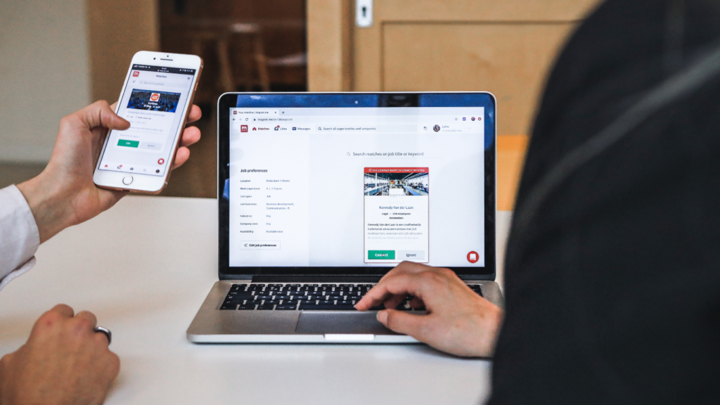
- Increasing Mobile Usage: More people than ever before are accessing the internet via smartphones and tablets. Responsive Web Design ensures that these users enjoy a wonderful experience no matter where they are.
- Diverse Device Landscape: The range of devices and screen sizes is greater than ever from smartwatches to giant desktop displays. RWD enables websites to properly serve all users, eliminating the need for distinct versions.
- Google’s Mobile-First Indexing: Google now primarily uses the mobile version of content for indexing and ranking. A non-responsive website risks losing search rankings and visibility.
- User Expectation for Seamless Experiences: Today’s users expect websites to load quickly and be easy to navigate on any device. Sites that fail to match these expectations may experience greater bounce rates and lost chances.
- E-commerce Growth: As more people shop online, responsive design becomes increasingly vital for e-commerce websites. A seamless shopping experience across all devices directly influences sales and consumer loyalty.
These points emphasise the growing necessity of flexible site design in creating inclusive and productive online experiences. It is no longer enough to appear excellent on a desktop; it is also necessary to ensure accessibility, engagement, and pleasure for all users, regardless of how they access the internet.
Key Strategies for Responsive Web Design
- Embrace a flexible layout: Consider a grid that can stretch or shrink to match the space it is provided. This adaptability enables all of the elements on a webpage—text, images, and buttons—to realign themselves harmoniously on any screen size.
- Optimise media for all screens: Just as a chameleon changes its colours to blend in with its surroundings, photos and videos on a responsive website modify their size and resolution to look their best on any screen. This tutorial provides practical techniques for optimising media.
- Prioritise User-Friendly Navigation: On smaller screens, complicated menus can be daunting. Simplifying navigation to a few important items, or using a dynamic “hamburger” menu, can greatly improve usability.
- Design with the User in Mind: Understanding how real people interact with your website on various devices is critical. This could include making buttons larger for easy pressing on touch devices or altering text widths and spacing to improve readability.
- Keep performance in mind: A great design isn’t much use if it takes hours to load. Optimising pictures, utilising caching, and minimising code can all help your site load faster, keeping consumers satisfied and interested.
The Road Ahead
The field of responsive design develops in tandem with new developments in technology. The emergence of augmented reality and wearable technology presents additional challenges and opportunities for RWD in the future. Staying ahead means continuously learning, testing, and iterating to ensure that your website not only looks good but also feels right, no matter how it’s accessed.
- Emerging Technologies: Combining wearable technology and augmented reality with RWD promises to offer more immersive and dynamic web experiences.
- Performance and Speed: Efforts to improve website performance and loading times remain top priorities, with an emphasis on speed optimisation to increase user retention.
- Privacy & Security: As worries about digital privacy grow, creating secure and privacy-conscious responsive websites becomes increasingly vital.
Conclusion
Responsive web design highlights how dynamic the internet is and how we interact with it. It is a notion that emphasises adaptability, user-centred design, and technology innovation to provide inclusive digital experiences. In the future, the RWD principles will serve as compass points, guiding us through the vast and ever-changing digital environment. Whether you’re a seasoned developer, a company owner trying to better your online presence, or simply a user who enjoys exploring the web, the essence of RWD affects us all, making our digital experiences more fun and accessible. In 2024 and beyond, embracing these strategies is not just about staying up; it’s about pushing ahead, collectively, into a more connected and responsive digital world.
e-commerce websitesmobile-friendly websiteresponsive designResponsive web designRWDSEOuser experienceWeb Designwebpagewebsite